Leanpub
In this tutorial, we will be using a publicly available web server, DynOmics, produced by Dr. Hongchun Li and colleagues at the University of Pittsburgh School of Medicine. This server is dedicated to performing molecular dynamics analysis by integrating the GNM and ANM models that we learned about in the main text.
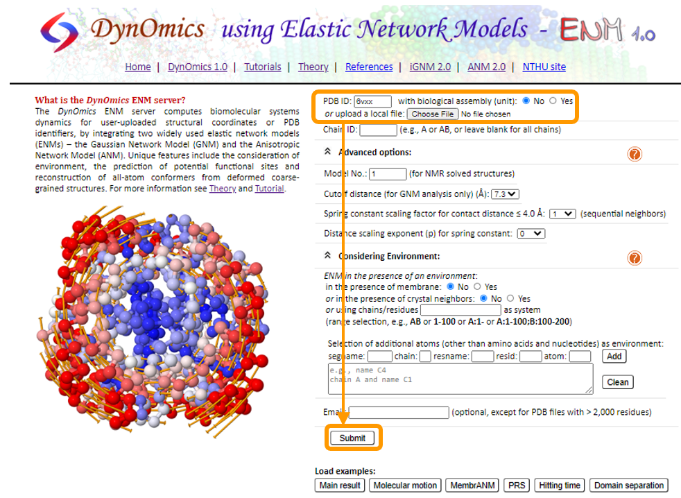
Navigate to the DynOmics homepage. This page contains many options that we can change to customize our analysis, but we will keep the default options for now.
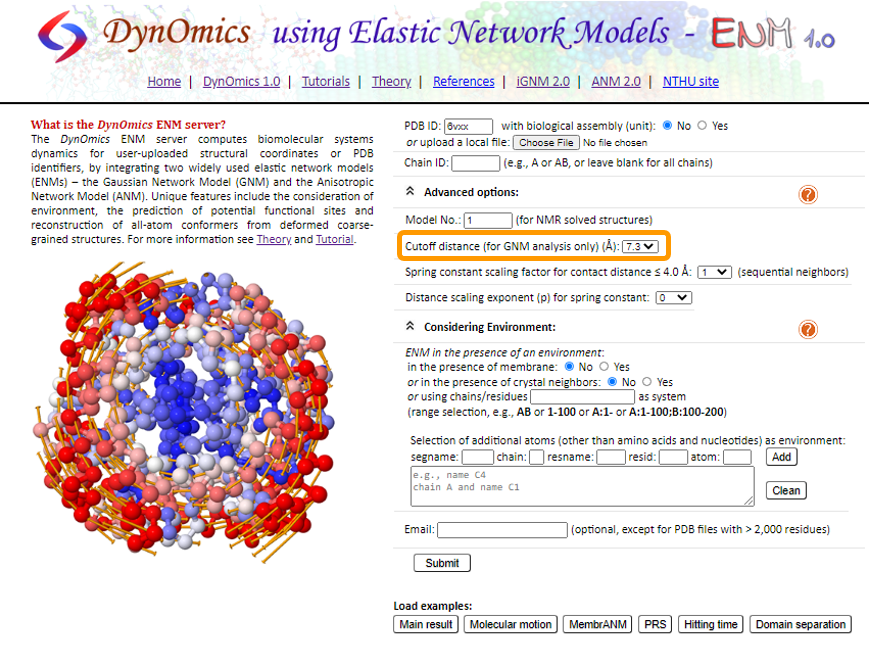
To choose our target molecule, we need to input the PDB ID. Since we will be performing the analysis on the SARS-CoV-2 spike protein, enter 6vxx under PDB ID. Then, click Submit.
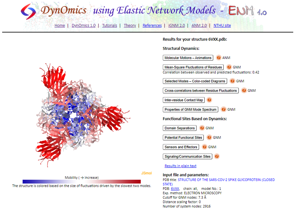
Once the analysis is complete, you will see all the ANM and GNM results listed next to an interactive visualization of the protein. In addition, the visualization is colored based on the predicted protein flexibility from the slow mode analysis.
Let’s start exploring some of the results by clicking Molecular Motions - Animations. This shows an interactive animation of the protein with the same coloring as before and showing the predicted motion of protein fluctuation based on ANM calculations. On the right, we can customize the animation by changing the vibrations and vectors to make the motions more pronounced.
We can also change the Mode index. We learned in the main text that the motion of protein fluctuations can be broken down into a collection of individual modes. By changing the Mode index, we can see the different contribution of each mode to the motion. The lower the index of the mode, the greater this mode contributes to the square fluctuations of the protein’s residues.

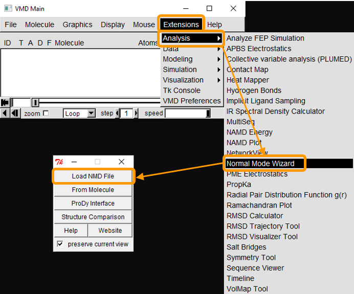
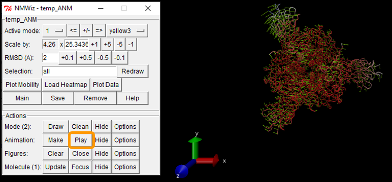
We can also download the calculations as a .nmd file and visualize it in VMD. If you are interested in using VMD, open the software and go to Extensions > Analysis > Normal Mode Wizard. Then, click Load NMD File and select the .nmd file that you downloaded. Now that the ANM calculation is loaded into VMD, you can customize the visualization and recreate the animation by clicking Animation: Play.
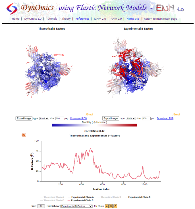
Next, return to DynOmics and click Mean-Square Fluctuations of Residues. On this page, you will see two visualizations of the protein, labeled Theoretical B-Factors and Experimental B-Factors as well as the B-factor plot. Recall that theoretical B-factors are calculated during GNM analysis, whereas experimental B-factors are included in the PDB. On the bottom, we can see the plot of the B-factors across the entire protein split into chains.
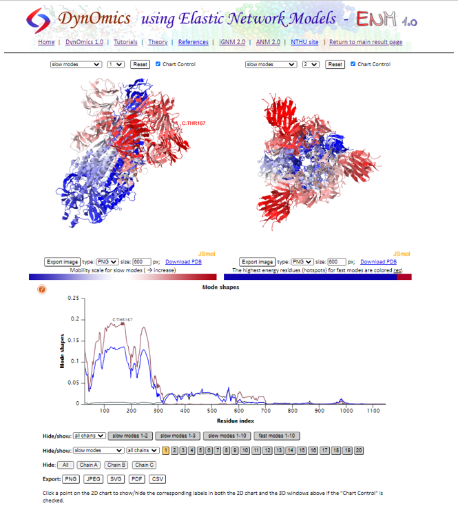
The next result page we will visit is Selected Modes - Color-coded Diagrams. On this page, we can see the shape of each individual mode, or an average of the “slowest” two, three, or ten modes. As we saw earlier in the main text, we can see a wide peak that corresponds to the RBD of the spike protein. Clicking the plot highlights the residue on the interactive visualizations.
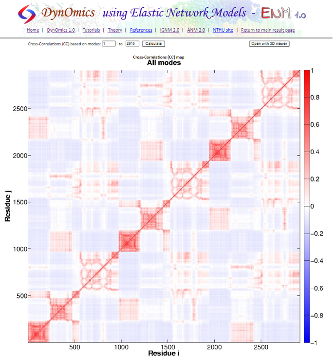
Next, click Cross-correlations between Residue Fluctuations, which shows the full cross-correlation heat map that we produced in the GNM tutorial.
Click Inter-residue Contact Map, which shows a visualization of the connected alpha carbon network based on the threshold distance, along with a contact map (called a “connectivity map”). The default threshold distance is set to 7.3 angstroms; to change the threshold, we need to perform the calculations again after changing the cutoff distance in Advanced options.

There is plenty more to say about the additional results produced by DynOmics; if you are interested in these results, please check out the DynOmics tutorial.
If you have made it this far, congratulations! You have become an expert in protein analysis. We will now head back to the main text to wrap up this module with some concluding thoughts.