Leanpub
Modeling proteins using tiny springs
You may think that simulating the movements of proteins with hundreds of amino acids will prove hopeless. After all, predicting the static structure of a protein has occupied biologists for decades! Yet part of what makes structure prediction so challenging is that the search space of potential structures is enormous. In contrast, once we have established the static structure of a protein, it will not deviate greatly from this static structure, and so the space of potential dynamic structures is narrowed down to those that are similar to the static structure.
A protein’s molecular bonds are constantly vibrating, stretching and compressing, much like that of the oscillating mass-spring system shown in the figure below. Bonded atoms are held at a specific distance apart due to the attraction and repulsion of the negatively charged electrons and positively charged nucleus. If you were to push the atoms closer together or pull them farther apart, then they would “bounce back” to their equilibrium.
 A mass-spring system in which a mass is attached to the end of a spring. The more that we move the mass from its equilibrium, the more that it will be repelled back toward equilibrium. Image courtesy: flippingphysics.com.
In an elastic network model (ENM), we imagine nearby alpha carbons of a protein structure to be connected by springs. Because distant atoms will not influence each other, we will only connect two alpha carbons if they are within some threshold distance of each other. In this lesson, we will describe a Gaussian network model (GNM), an ENM for molecular dynamics.
Representing random movements of alpha carbons
We will introduce GNMs using our old friend human hemoglobin (1A3N.pdb). We first convert hemoglobin into a network of nodes and springs, in which each alpha carbon is given by a node, and two alpha carbons are connected by a string if they are within a threshold distance; the figure below uses a threshold value of 7.3 angstroms.
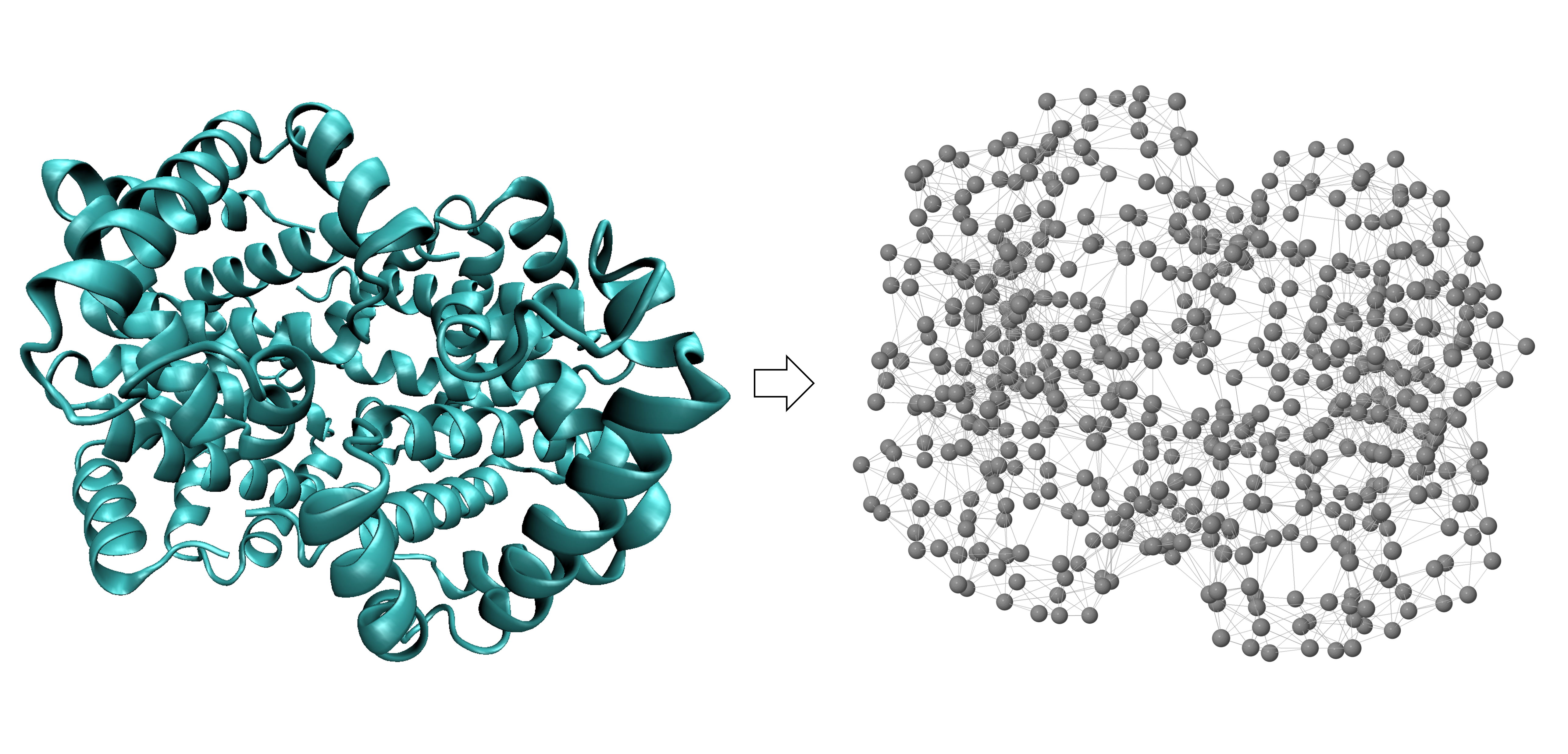 Conversion of human hemoglobin (left) into a network of nodes and springs (right) in which two nodes are connected by a spring if they are within a threshold distance of 7.3 angstroms.
The alpha carbons in a protein are subject to random fluctuations that cause them to move from their equilibrium positions. These fluctuations are Gaussian, meaning that the alpha carbon deviates randomly from its equilibrium position according to a normal (bell-shaped) distribution. In other words, although an alpha carbon’s position is due to random chance, it is more likely to be near the equilibrium than far away.
Although atomic fluctuations are powered by randomness, the movements of protein atoms are heavily correlated. For example, imagine the simple case in which all of a protein’s alpha carbons are connected in a straight line. If we pull the first alpha carbon away from the center of the protein, then the second alpha carbon will be pulled along with it. Our goal is to understand how the movements of every pair of alpha carbons may be related.
Inner products and cross-correlations
As illustrated in the figure below, the variable vector \(\mathbf{R_{ij}}\) represents the distance between nodes i and j. The equilibrium position of node \textvar{i} is represented by the vector \(\mathbf{R_i^0}\), and its displacement from equilibrium is denoted by the (variable) vector \(\mathbf{\mathbf{\Delta R_i}}\). The distance between node \textvar{i} and node \textvar{j} at equilibrium is denoted by the vector \(\mathbf{R_{ij}^0}\), which is equal to \(\mathbf{R_j^0} - \mathbf{R_i^0}\).
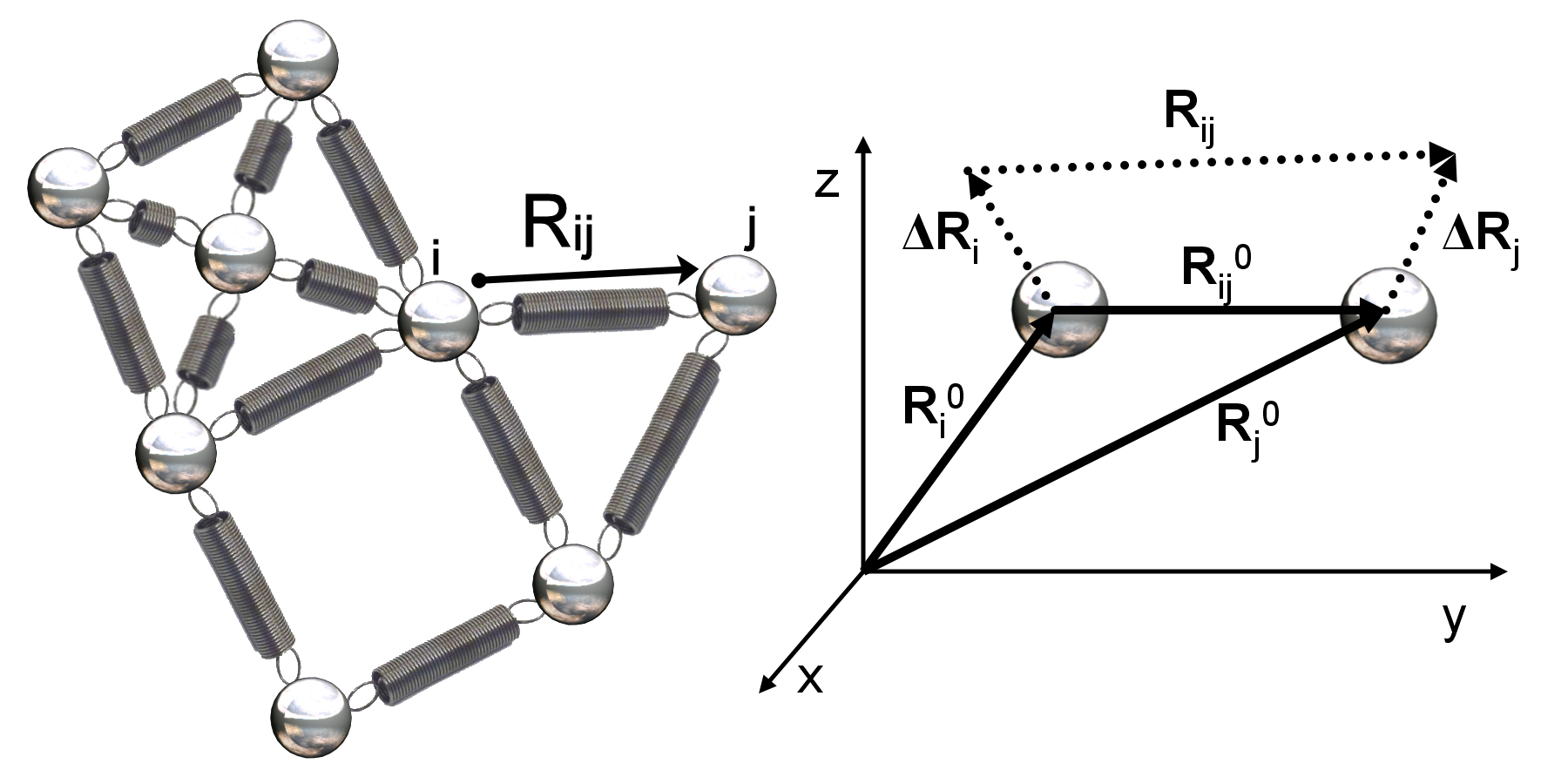 (Left) A small network of nodes connected by springs deriving from a protein structure. The distance between two nodes i and j is denoted by the variable \(\mathbf{R_{ij}}\). (Right) Zooming in on two nodes i and j that are within the threshold distance and therefore connected by a spring. The equilibrium positions of node i and node j are represented by the distance vectors \(\mathbf{R_i^0}\) and \(\mathbf{R_j^0}\), with the distance between them denoted \(\mathbf{R_{ij}^0}\), which is equal to \(\mathbf{R_j^0} - \mathbf{R_i^0}\). The vectors \(\mathbf{\mathbf{\Delta R_i}}\) and \(\mathbf{\mathbf{\Delta R_j}}\) represent the nodes’ respective changes from equilibrium. Image courtesy: Ahmet Bakan.
To determine how the movements of alpha carbons i and j are related, we need to study the fluctuation vectors \(\mathbf{\mathbf{\Delta R_i}}\) and \(\mathbf{\mathbf{\Delta R_j}}\). Do these vectors point in similar or opposing directions?
To answer this question, we compute the inner product, or dot product, of the two vectors, \(\langle \mathbf{\mathbf{\Delta R_i}}, \mathbf{\mathbf{\Delta R_j}} \rangle\). The inner product of two vectors x = (x1, x2, x3) and y = (y1, y2, y3) is given by <x, y> = x1 · y1 + x2 · y2 + x3 · y3. If x and y are perpendicular, then <x, y> is equal to zero. The more that the two vectors point in the same direction, the larger the value of <x, y>. And the more that the two vectors point in opposite directions, the more negative the value of <x, y>.
STOP: Say that x = (1, -2, 3), y = (2, -3, 5), and z = (-1, 3, -4). Compute the inner products <x, y> and <x, z>. Ensure that your answers match the preceding observation about the value of the inner product and the directions of vectors.
The inner product is also useful for representing the mean-square fluctuation of an alpha carbon, or the expected squared distance of node i from equilibrium. If the fluctuation vector \(\mathbf{\Delta R_i}\) is represented by the coordinates (x, y, z), then its square distance from equilibrium is x2 + y2 + z2, which is the inner product of the fluctuation vector with itself, \(\langle \mathbf{\Delta R_i}, \mathbf{\Delta R_i} \rangle\). Alpha carbons having large values of this mean-square fluctuation may belong to more flexible regions of the protein.
Note: In practice, we will not know the exact values for the \(\mathbf{\Delta R_i}\) and must compute the inner products of fluctuation vectors indirectly using linear algebra, which is beyond the scope of this work. A full treatment of the mathematics of GNMs can be found in the chapter at https://www.csb.pitt.edu/Faculty/bahar/publications/b14.pdf
Long vectors pointing in the same direction will have a larger inner product than short vectors pointing in the same direction. To have a metric for the correlation of two vectors’ movements that is independent of their length, we should therefore normalize the inner product. The cross-correlation of alpha carbons i and j is given by
\[C_{ij} = \dfrac{\langle \mathbf{\Delta R_i}, \mathbf{\Delta R_j} \rangle}{\sqrt{\langle \mathbf{\Delta R_i}, \mathbf{\Delta R_i} \rangle \cdot \langle \mathbf{\Delta R_j}, \mathbf{\Delta R_j} \rangle}}.\]After normalization, the cross-correlation ranges from -1 to 1. A cross-correlation of -1 means that the two alpha carbons’ movements are completely anti-correlated, and a cross-correlation of 1 means that their movements are completely correlated.
After computing the cross-correlation of every pair of alpha carbons in a protein structure with n residues, we obtain an n × n cross-correlation matrix C such that C(i, j) is the cross-correlation between amino acids i and j. We can visualize this matrix using a heat map, in which we color matrix values along a spectrum from blue (-1) to red (1). The heat map for the cross-correlation matrix of human hemoglobin is shown in the figure below.
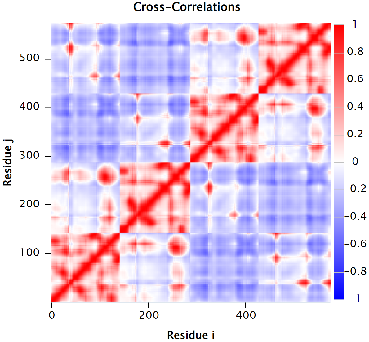 The normalized cross-correlation heat map of human hemoglobin (PDB: 1A3N). Red regions indicate correlated residue pairs which move in the same direction; blue regions indicate anti-correlated residue pairs which move in opposite directions.
The cross-correlation map of a protein contains complex patterns of correlated and anti-correlated movement of the protein’s atoms. For example, we should not be surprised that the main diagonal of the above cross-correlation heat map is colored red, since alpha carbons that are near each other in a polypeptide chain will likely have correlated movements. Furthermore, the regions of high correlation near the main diagonal typically provide information regarding the protein’s secondary structures, since amino acids belonging to the same secondary structure will typically move in concert.
High correlation regions that are far away from the matrix’s main diagonal provide information about the tertiary structure of the protein, such as domains that are distant in terms of sequence but work together in the protein structure.
In the cross-correlation heat map in the figure above, we can see four squares of positive correlation along the main diagonal, representing the four subunits of hemoglobin from bottom left to top right: α1, β1, α2, and β2. Note that the first and third squares exhibit the same patterns; these squares correspond to α1 and α2, respectively. Similarly, the second and fourth squares correspond to β1 and β2, respectively.
STOP: What other patterns do you notice in the hemoglobin cross-correlation heat map?
Mean-square fluctuations and B-factors
Just as we can visualize cross-correlation, we would also like to visualize the mean-square fluctuations that the GNM model predicts. During X-ray crystallography, the displacement of atoms within the protein crystal decreases the intensity of the scattered X-ray, creating uncertainty in the positions of atoms. A B-factor, also known as temperature factor or Debye-Waller factor, is a measure of this uncertainty.
It is beyond the scope of this work, but the theoretical B-factor of the i-th alpha carbon is equal to a constant factor times the estimated mean-square fluctuation,
\[B_i = \frac{8 \pi^2}{3} \langle \mathbf{\Delta R_i}, \mathbf{\Delta R_i} \rangle.\]Once we have computed theoretical B-factors, we can compare them against experimental results. The figure below shows a 3-D structure of the hemoglobin protein, with amino acids colored along a spectrum according to both theoretical and experimental B-factors for the sake of comparison. In these structures, red indicates large B-factors (mobile amino acids), and blue indicates small B-factors (static amino acids). Note that the mobile amino acids are generally found at the ends of secondary structures in the outer edges of the protein, which is expected because the boundaries between secondary structures typically contain highly fluctuating residues. This figure confirms the general observation that theoretical B-factors tend to correlate well with experimental B-factors in practice1 and offers one more example of a property of a biological system that we can infer computationally without the need for costly experimentation.
It is beyond the scope of this work, but the theoretical B-factors are given byIn other words, once we can estimate the mean-square fluctuations \(\langle \mathbf{\Delta R_i}, \mathbf{\Delta R_i} \rangle\), the theoretical B-factor of the i-th alpha carbon is equal to a constant times this inner product. This theoretical B-factor tends to correlate well with theoretical B-factors in practice.1
 (Top): Human hemoglobin colored according to theoretical B-factors calculated from GNM (left) and experimental B-factors (right). Blue indicates low B-factors, and red indicates high B-factors. Subunit α1 is located at the top left quarter of the protein. (Bottom): A 2-D plot comparing the theoretical (blue) and experimental (black) B-factors of subunit α1. The theoretical and experimental B-factors are correlated with a coefficient of 0.63.
Normal mode analysis
When listening to your favorite song, you probably do not think of the individual notes that it comprises. Yet a talented musician can dissect the song into the set of notes that each instrument contributes to the whole. Just because the music combines a number of individual sound waves does not mean that we cannot deconvolve the music into its substituent waves.
All objects, from colossal skyscrapers to tiny proteins, vibrate. And, just like in our musical example, these oscillations are the net result of individual waves passing through the object. The paradigm of breaking down a collection of vibrations into the comparatively small number of “modes” that summarize them is called normal mode analysis (NMA) .
The mathematical details are complicated, but by deconvolving a protein’s movement into individual normal modes, we can observe how each mode affects individual amino acids. As we did with B-factors, for a given mode, we can visualize the results of a mode using a line graph, called the mode shape plot. The x-axis of this plot corresponds to the amino acid sequence of the protein, and the height of the i-th position on the x-axis corresponds to the magnitude of the square fluctuation contributed by the mode on the protein’s i-th amino acid.
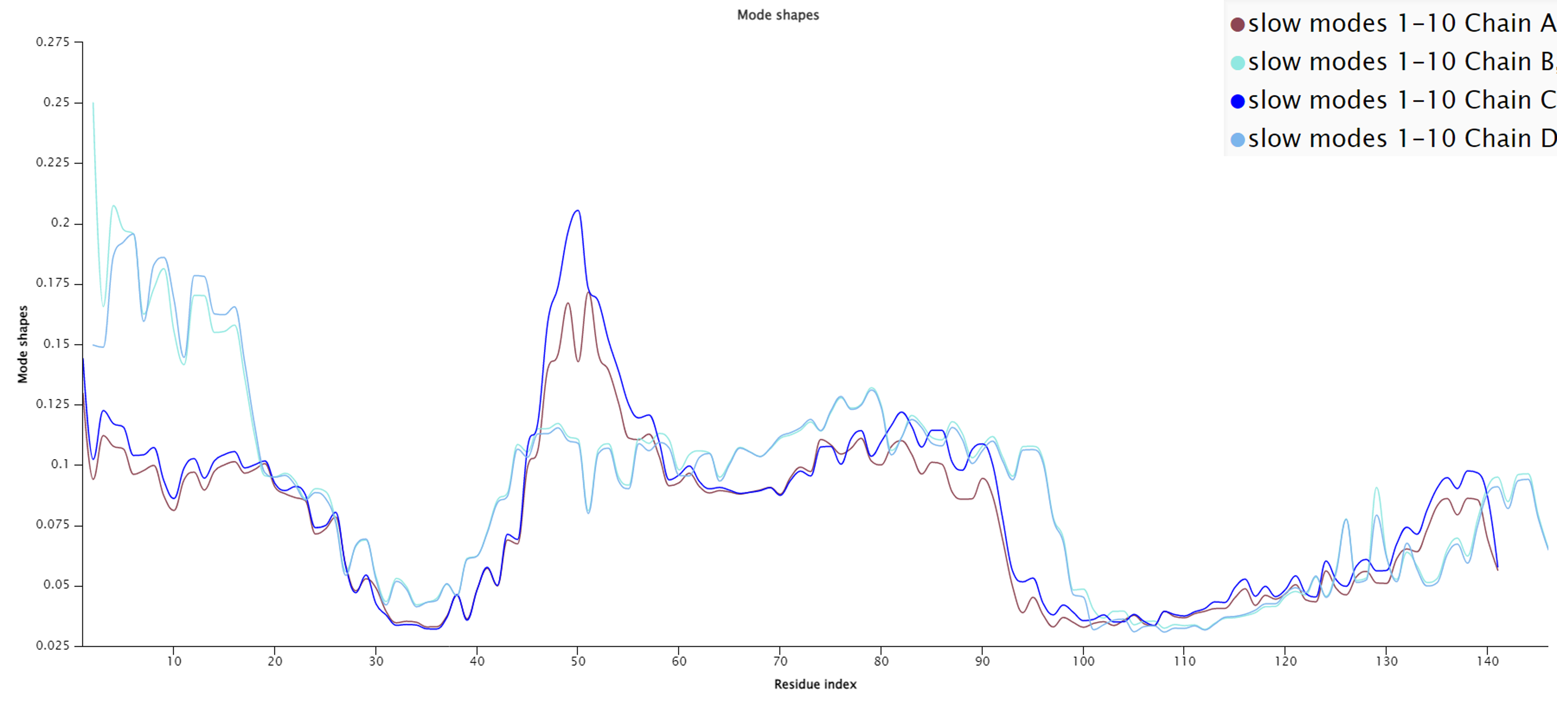
Just as a piece of music can have one instrument that is much louder than another, some of the oscillations contributing to an object’s vibrations may be more significant than others. NMA also determines the degree to which each mode contributes to the overall fluctuations of a protein; the mode contributing the most is called the slowest mode of the protein. The figure below shows a mode shape plot of the slowest mode for each of the four subunits of human hemoglobin and reveals that all four subunits have similar mode shape for the slowest mode.
 (Top) Visualization of human hemoglobin colored based on GNM slow mode shape for the slowest mode (left) and the average of the ten slowest modes (right), or the ten modes that contribute the most to the square fluctuation. Regions of high mobility are colored red, corresponding to peaks in the mode shape plot. (Bottom) A mode shape plot of the slowest mode for human hemoglobin, separated over each of the four chains, shows that the four chains have a similar slowest mode.
Similar to cross-correlation, analyzing a protein’s mode shapes will give insights into the structure of the protein, and comparing mode shapes for two proteins can reveal differences. For example, the mode shape plots in the figure above show that the slowest mode shape for the four subunits of hemoglobin are quite similar.
We should consult more than just a single mode when completing a full analysis of a protein’s molecular dynamics. Below is the slow mode plot averaging the “slowest” ten modes of hemoglobin, meaning the ten modes that have the greatest effect on mean fluctuation. Unlike when we examined only the slowest mode, we can now see a stark difference when comparing α subunits (chains A and C) to β subunits (chains B and D).
 The average mode shape of the slowest ten modes for each of the four human hemoglobin subunits using GNM. Note that the plots for α subunits (chains A and C) and β subunits (chains B and D) differ more than when considering only the slowest mode.
We are now ready to apply what we have learned to build a GNM for the SARS-CoV and SARS-CoV-2 spike proteins in a tutorial and analyze the dynamics of these proteins using the plots that we have introduced in this section.
Molecular dynamics analyses of SARS-CoV and SARS-CoV-2 spike proteins using GNM
The figure below shows the cross-correlation heat maps of SARS-CoV and SARS-CoV-2 spike proteins, indicating that these proteins may have similar dynamics.
 The cross-correlation heat maps of the SARS-CoV-2 spike protein (top-left), SARS-CoV spike protein (top-right), single chain of the SARS-CoV-2 spike protein (bottom-left), and single-chain of the SARS-CoV spike protein (bottom-right).
The next figure shows the mode shape plot for the slowest mode of the two proteins. The protein region between positions 200 and 500 of the spike protein is the most mobile and overlaps with the RBD region, found between residues 331 to 524.
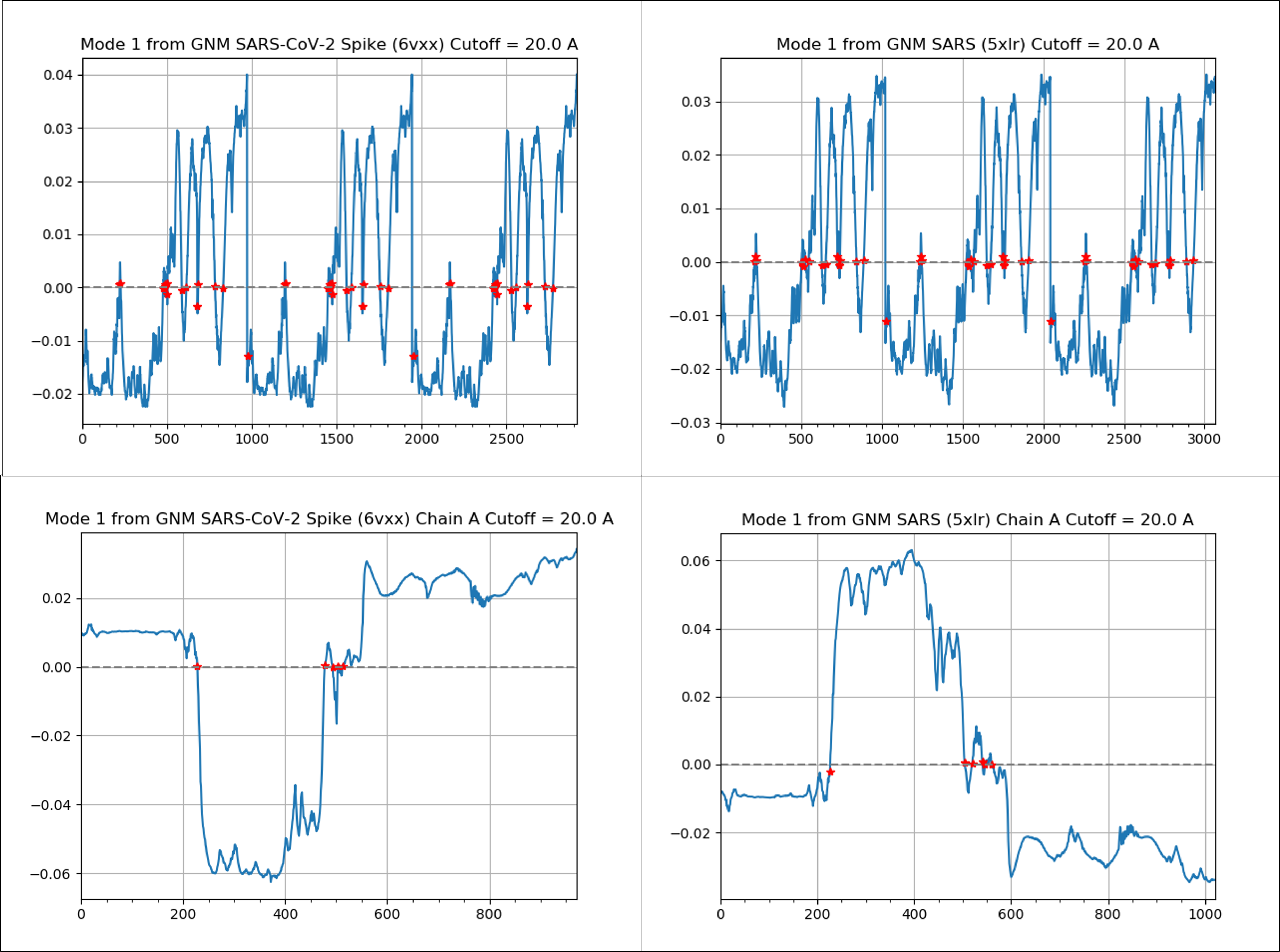 (Top) A mode shape plot for the slowest mode of the SARS-CoV-2 spike protein (left) and SARS-CoV spike protein (right). (Bottom) A mode shape plot for the slowest mode of a single chain of the SARS-CoV-2 spike protein (left) and a single chain of the SARS-CoV spike protein (right). Note that the plot on the right is inverted compared to the one on the left because of a choice made by the software, but the two plots have the same shape if we consider the absolute value. These plots show that the two viruses have similar dynamics, and that residues 200 – 500 fluctuate the most, a region that overlaps heavily with the RBD.
We can also examine the mode shape plot for the average of the slowest ten modes for the two spike proteins (see figure below). Using this plot, we color flexible parts of the protein red and inflexible parts of the protein blue.
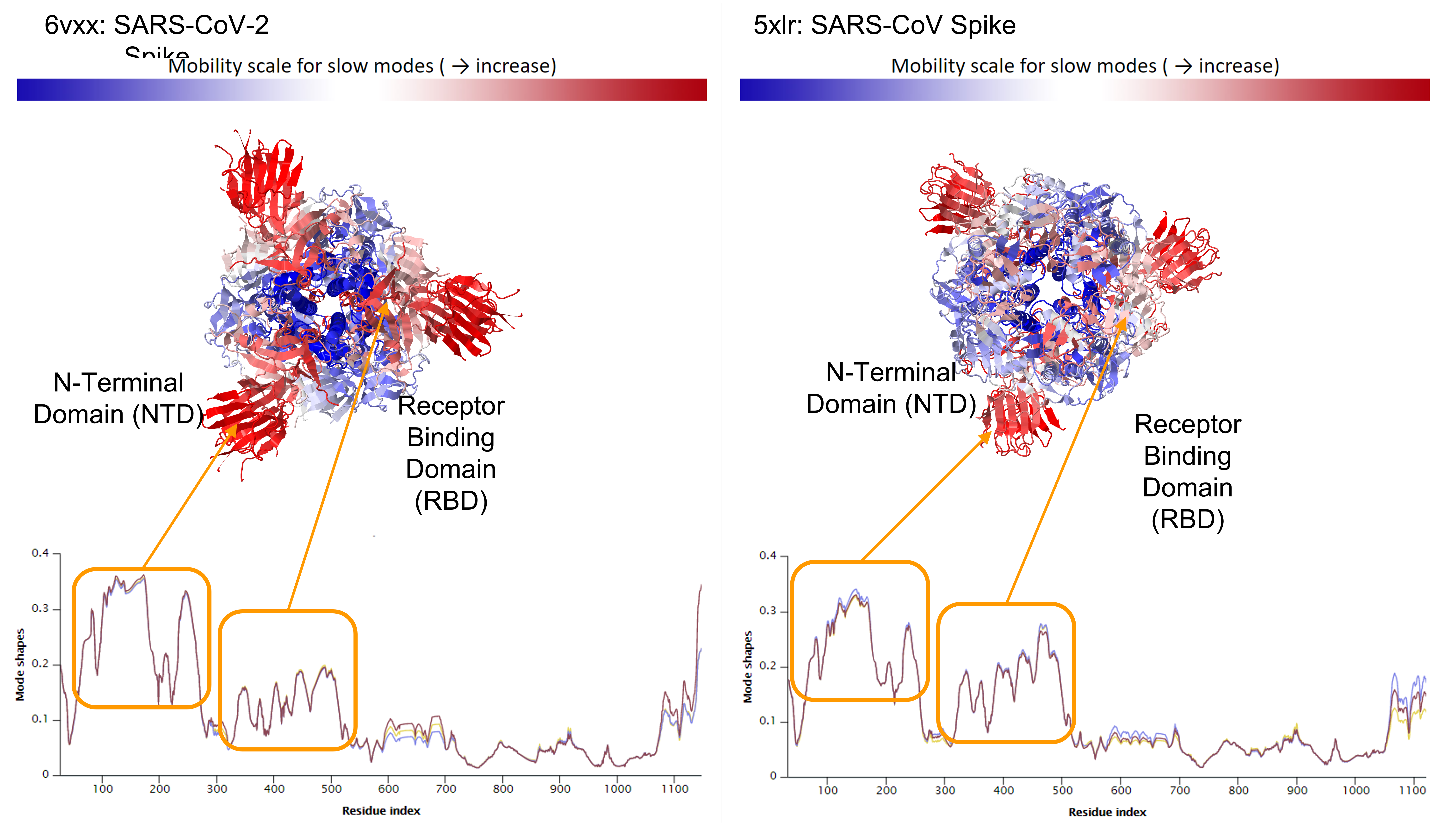 Average mode shape of the slowest ten modes of SARS-CoV-2 Spike (left) and SARS-CoV Spike (right). The first peak corresponds to the N-Terminal Domain (NTD) and the second peak corresponds to the RBD. Above the mode shape plots, the viral spike proteins are colored according to the value of mode shape, with high values colored red and indicating greater predicted flexibility; note that the SARS-CoV-2 NTD is predicted to be more flexible than that of SARS-CoV.
The mode shape plots show that the RBD of both spike proteins are highly flexible, which agrees with the biological functions of these regions. When the RBD interacts with the ACE2 enzyme on human cells, the RBD of one of the three chains “opens up”, exposing itself to more easily bind with ACE2.
The figure above highlights another flexible region, the spike protein’s non-terminal domain (NTD), which appears to be more mobile in SARS-CoV-2. Like the RBD, the NTD also mediates viral infection, but by interacting with DC-SIGN and L-SIGN receptors rather than ACE22. These receptors are present on macrophages and dendritic cells, allowing SARS-CoV-2 to infect different tissues such as the lungs, where ACE2 expression levels are low, which may help explain why SARS-CoV-2 is more likely than SARS-CoV to progress to pneumonia.
The analysis provided by GNM is compelling, but it ultimately relies on the estimation of inner products \(\langle \mathbf{\Delta R_i}, \mathbf{\Delta R_i} \rangle\) and \(\langle \mathbf{\Delta R_i}, \mathbf{\Delta R_j} \rangle\). Although the \(\mathbf{\Delta R_i}\) are vectors, meaning that they have a direction as well as a magnitude, the inner products have only a value, and so we therefore cannot infer anything about the direction of a protein’s movements. For this reason, GNM is said to be isotropic, meaning that it only considers the magnitude of force exerted on the springs between nearby molecules and ignores any global effect on the directions of these forces. In the next lesson, we will generalize GNMs to take these movements into account.
-
Yang, L., Song, G., & Jernigan, R. L. 2009. Comparisons of experimental and computed protein anisotropic temperature factors. Proteins, 76(1), 164–175. https://doi.org/10.1002/prot.22328 ↩ ↩2
-
Soh, W. T., Liu, Y., Nakayama, E. E., Ono, C., Torii, S., Nakagami, H., Matsuura, Y., Shioda, T., Arase, H. The N-terminal domain of spike glycoprotein mediates SARS-CoV-2 infection by associating with L-SIGN and DC-SIGN. ↩