Leanpub
The curse of dimensionality
Things get weird in multi-dimensional space.
Consider a circle inscribed in a square, as shown in the figure below. The ratio of the area of the circle to the area of the square is π/4 ≈ 0.785, regardless of the square’s side length. When we move to three dimensions and have a sphere inscribed in a cube, the ratio of the volume of the sphere to the volume of the cube is (4π/3)/8 ≈ 0.524.
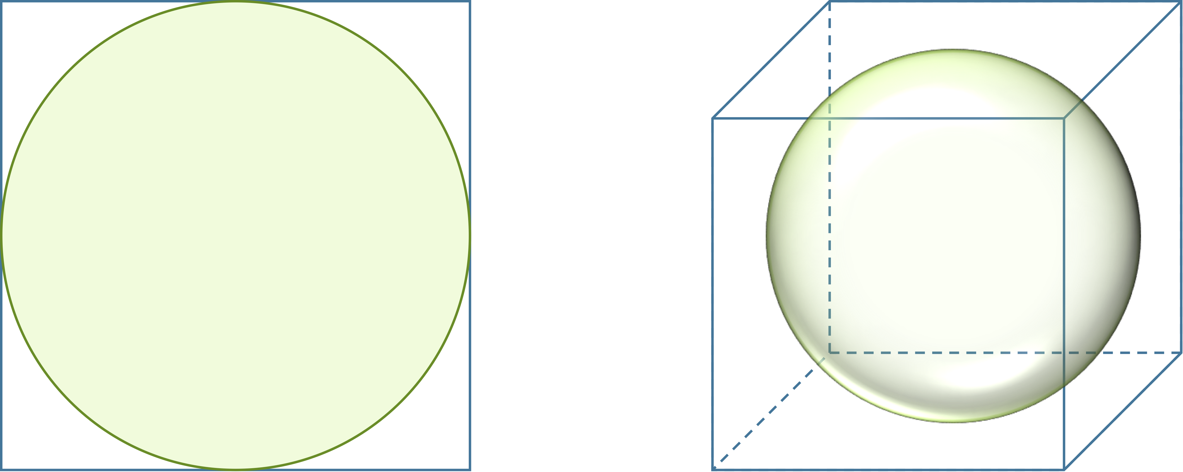 A circle inscribed in a square takes up more of the square (78.5 percent) than a sphere inscribed in a cube (52.4 percent).
We define an n-dimensional unit sphere as the set of points in n-dimensional space whose Euclidean distance from the origin is at most 1, and an n-dimensional cube as the set of points whose coordinates are all between 0 and 1. A precise definition of the volume of a multi-dimensional object is beyond the scope of our work, but as n increases, the sphere takes up less and less of the cube. As n tends toward infinity, the ratio of the volume of the n-dimensional unit sphere to the volume of the n-dimensional unit cube approaches zero!
One way of interpreting the vanishing of the sphere’s volume is that as n increases, an n-dimensional cube has more and more corners in which points can hide from the sphere. Most of the cube’s volume therefore winds up scattering outward from its center.
The case of the vanishing sphere may seem like an arcane triviality that holds interest only for mathematicians toiling in fluorescently lit academic offices at strange hours. Yet this phenomenon is just one manifestation of a profound paradigm in data science called the curse of dimensionality, which is a collection of principles that arise in higher dimensions that run counter to our intuition about three-dimensional space.
How the curse of dimensionality affects classification
In the previous lesson, we discussed sampling n points from the boundary of a two-dimensional WBC nuclear image, thus converting the image into a vector in a space with 2n dimensions. We argued that n needs to be sufficiently large to ensure that comparing the vectors of two images will give an accurate representation of how similar their shapes are. Yet increasing n means that we need to be careful about the curse of dimensionality.
Say that we sample k points randomly from the interior of an n-dimensional cube. Let dmin and dmax denote the minimum and maximum distance from any of our points to the origin, respectively. As n grows, the ratio dmin/dmax heads toward 1; in other words, the minimum distance between points becomes indistinguishable from the maximum distance between points.
This other facet of the curse of dimensionality means that algorithms like k-NN, which classify points with unknown classes based on nearby points with known classes, may not perform well in higher-dimensional spaces in which even similar points tend to fly away from each other.
Because of the curse of dimensionality, it makes sense to reduce the number of dimensions before performing any further analysis such as classification. One way to reduce the number of dimensions would be to reduce the number of features used for generating a vector, especially if we have reason to believe that some features are more informative than others. This approach will likely not work for our WBC image example, since it is not clear why one point on the boundary of our images would be inherently better than another, and we already know about the dangers of undersampling points.
Instead, we will reduce the number of dimensions of our shape space without removing any features from the data. The concept of reducing the dimension of a space may be non-intuitive, and so we will explain dimension reduction in the context of two- and three-dimensional space; our approach may be more familiar than you think.
Dimension reduction with principal components analysis
We will introduce dimension reduction using the iris flower dataset that we introduced when discussing classification. Although this dataset has four features, we will focus again on only petal length and width, which we plot against each other in the figure below. We can trust our eyes to notice the clear pattern: as iris petal width increases, petal length tends to increase as well.
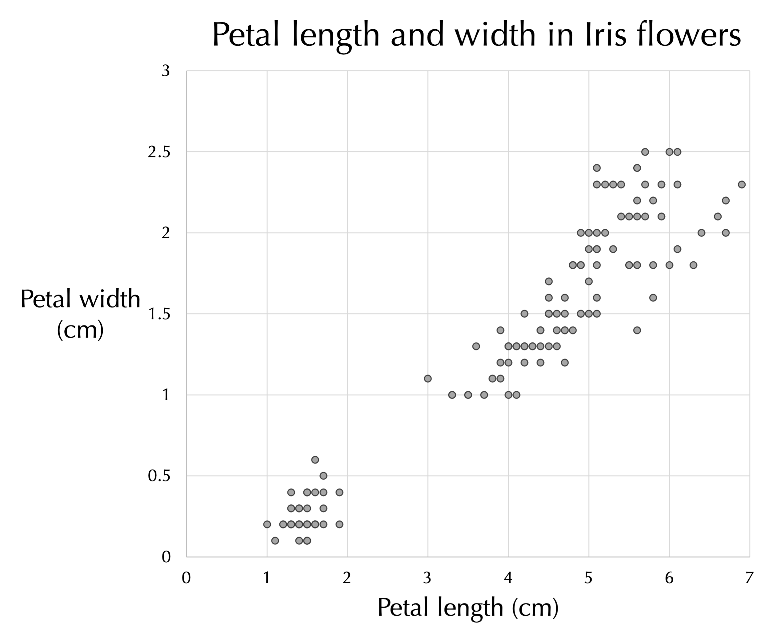 Petal length (x-axis) plotted against petal width (y-axis) for all flowers in the iris flower dataset.
A line drawn through the center of the data (see figure below) provides a reasonable estimate of a flower’s petal width given its length, and vice-versa. This line, a one-dimensional object, therefore approximates a collection of points in two dimensions.
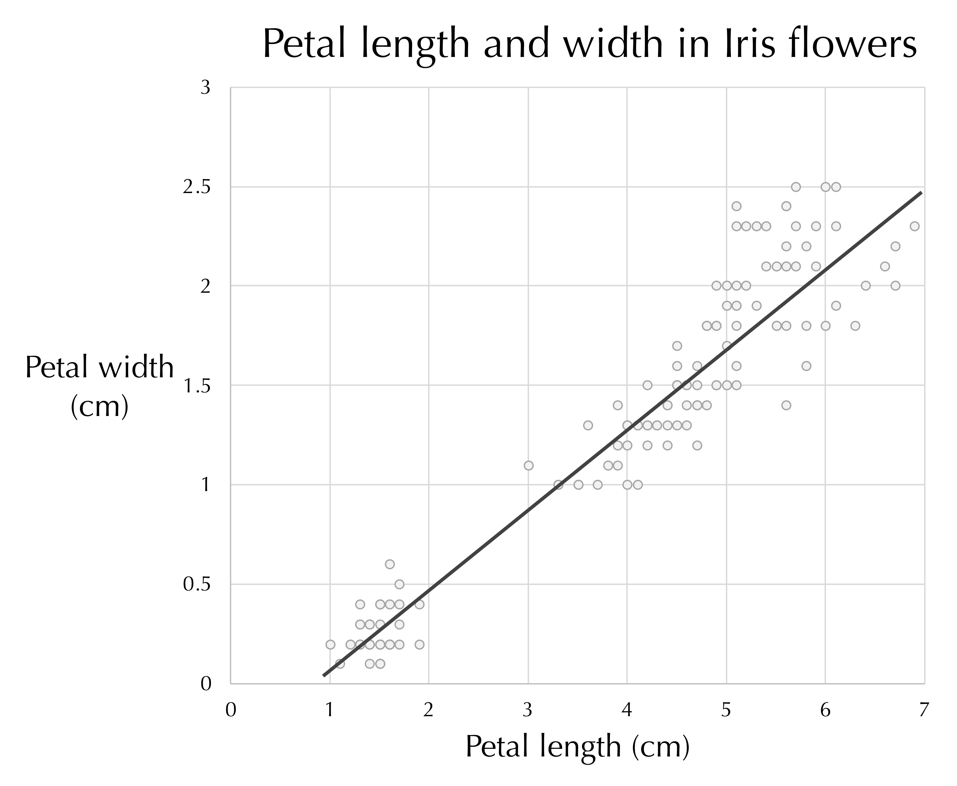 A line passing through the plot of iris petal length against petal width. The line tells us approximately how long we can expect an iris petal to be given the petal’s width, and vice-versa.
STOP: How could we have determined the line in the figure above?
Long ago in math class, you may have learned how to choose a line to best approximate a two-dimensional dataset using linear regression, which we will now briefly describe. In linear regression, we first establish one variable as the dependent variable, which is typically assigned to the y-axis. In our iris flower example, the dependent variable is petal width.
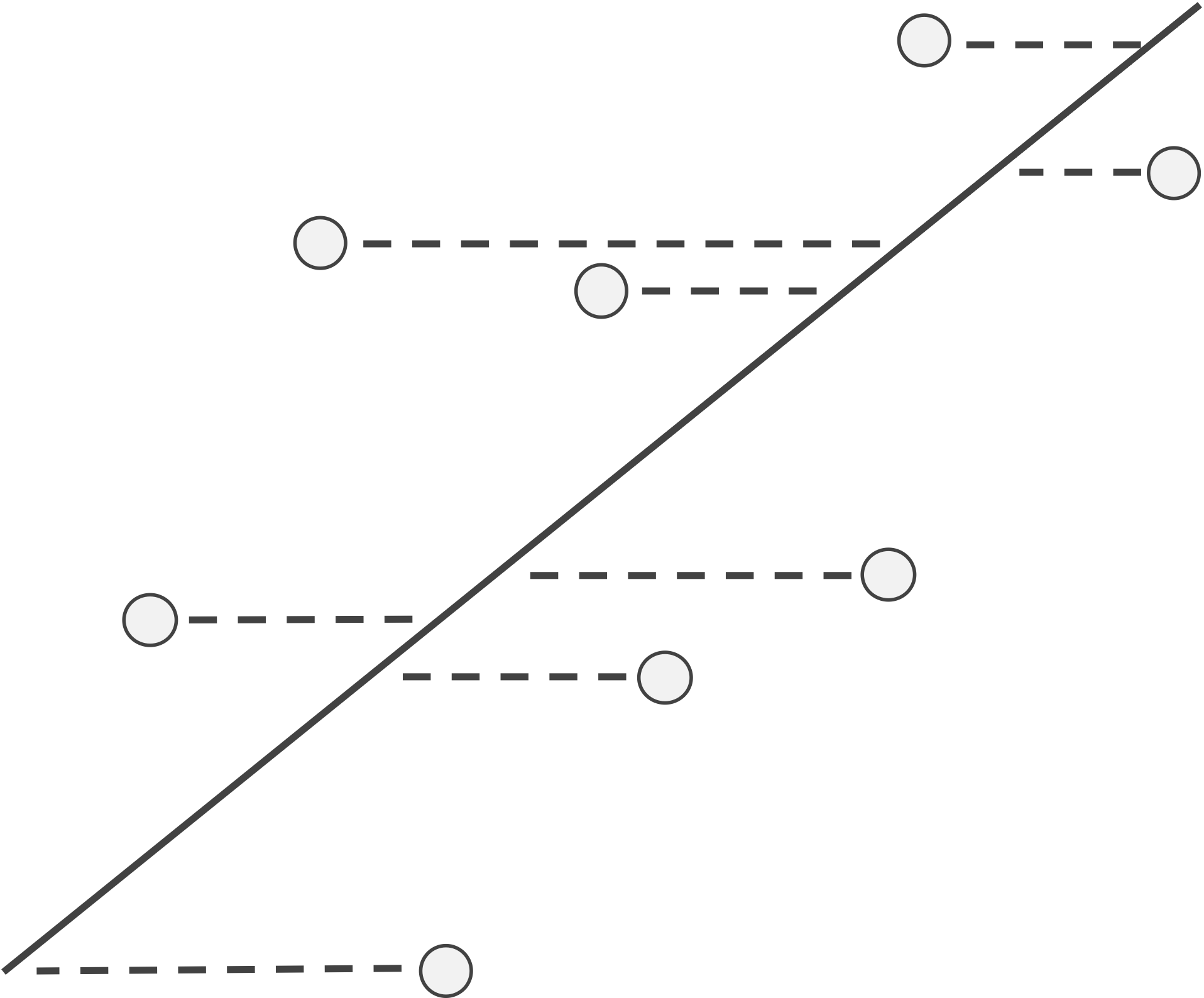
Given a line, we use L(x) to denote the y-coordinate of the point on the line corresponding to a given x-coordinate. For this line, we can then define the residual of a data point (x, y) as the difference y - L(x) between its y-coordinate and the y-coordinate on the line corresponding to x. If a residual is positive, then the data point lies “above” the line, and if the residual is negative, then the point lies “below” the line (see figure below).
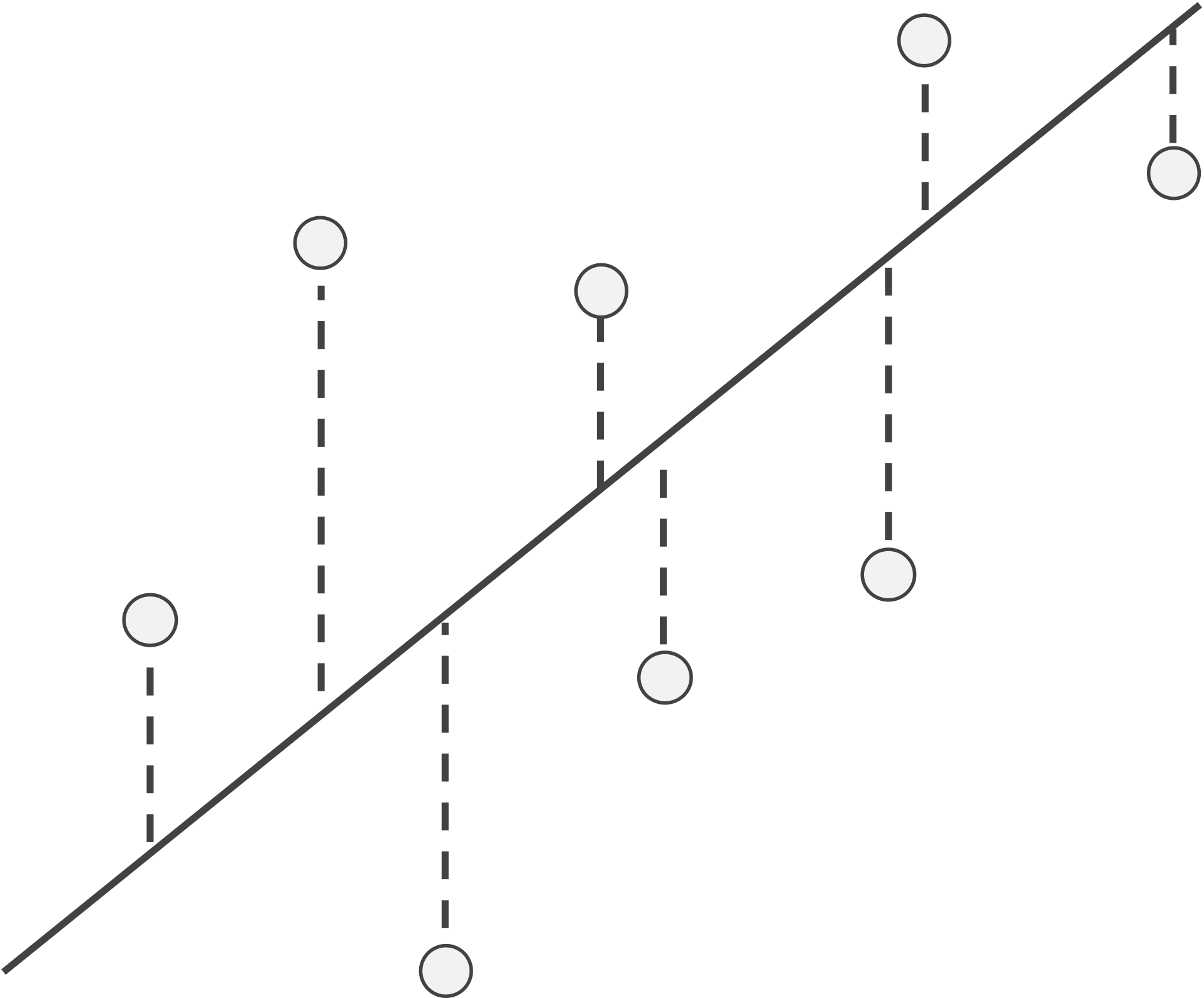 An example line and data points with a visual depiction of the points’ residuals (dashed lines), which visualize the differences in actual y-values and those estimated by the line. The absolute value of a residual is the length of its dashed line, and the sign of a residual corresponds to whether it lies above or below the line.
As the line changes, so will the points’ residuals. The smaller the residuals become, the better the line fits the points. In linear regression, we are looking for the line that minimizes the sum of squared residuals.
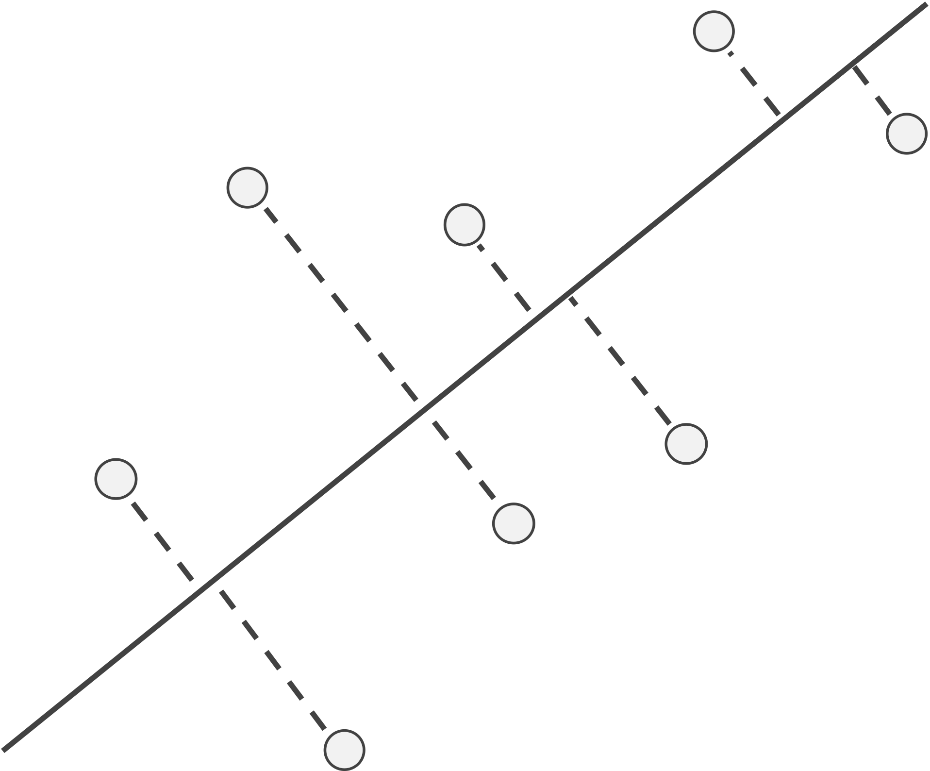
Linear regression is not the only way to fit a line to a collection of data. Choosing petal width as the dependent variable makes sense if we want to explain petal width as a function of petal length, but if we were to make petal length the dependent variable instead, then linear regression would minimize the sum of squared residuals in the x-direction, as illustrated in the figure below.
 If x is the dependent variable, then the residuals with respect to a line become the horizontal distances between points and the line, and linear regression finds the line that minimizes the sum of the squares of these horizontal residuals over all possible lines through the data.
Note: The linear regression line will likely differ according to which variable we choose as the dependent variable, since the quantity that we are minimizing changes. However, if a linear pattern is present in our data, then the two regression lines will be similar.
STOP: For the iris flower dataset, which of the two choices for dependent variable is better?
The preceding question is implying that no clear causality underlies the correlation between petal width and petal length, which makes it difficult to prioritize one variable over the other as the dependent variable. For this reason, we will revisit how we are defining the line that best fits the data.
Instead of considering residuals based on distances to the line in only the x-direction or the y-direction, we can treat both variables equally. To do so, we examine the distance from each data point to its nearest point on the line (see figure below), which is called the projection of the point onto the line. The line that minimizes the sum of the squared distances between each point and its projection onto the line is called the \textdefnogloss{first principal component} of the data.
Instead of considering residuals based on distances to the line in only the x-direction or the y-direction, we can instead examine the distances from our data points to the line, as shown in the figure below. The line minimizing the sum of the squares of these distances treats each of the two variables equally and is called the first principal component of the data.
 A line along with a collection of points; dashed lines show the shortest segments connecting each data point to its projection onto the line, which is the point on the line that is closest to the data point.
The first principal component is often said to be the line that “explains the most variance in the data”. If a correspondence exists between lily petal width and length, then the distances from points to the first principal component correspond to variation due to randomness. By minimizing the sum of squares of these distances, we limit the amount of variation in our data that we cannot explain with a linear relationship.
The following animated GIF shows a line rotating through a collection of data points, with the distance from each point to the line shown in red. As the line rotates, we can see the distances from the points to the line change.
 An animated GIF showing that the distances from points to their projections onto a line change as the line rotates. The line of best fit is the one in which the sum of the square of these distances is minimized. Source: amoeba, StackExchange user.1
Another benefit of finding the first principal component of a dataset is that it allows us to reduce the dimensionality of our dataset from two dimensions to one. In the figure above, the projection of each point onto the line is shown in red. The projections of a collection of data points onto their first principal component gives a one-dimensional representation of the data.
Say that we wanted to generalize these ideas to three-dimensional space. The first principal component would offer a one-dimensional explanation of the variance in the data, but perhaps a line is insufficient to this end. The points could lie very near to a plane (a two-dimensional object), and projecting these points onto the nearest plane would effectively reduce the dataset to two dimensions, as shown in the figure below.

 (Top) A collection of seven points, each labeled with a different color. Each point is projected onto the plane that minimizes the sum of squared distances between points and the plane. The line indicated is the first principal component of the data; this line lies within the plane, which is the case for any dataset. (Bottom) A reorientation of the plane such that the first principal component is shown as the x-axis, with colored points corresponding to the projections onto the plane from the top figure. The y-axis of this plane is known as the “second principal component” of the data.
Our three-dimensional minds will not permit us the intuition needed to visualize the extension of this idea into higher dimensions, but we can generalize these concepts mathematically. Given a collection of m data points (or vectors) in n-dimensional space, we are looking for a d-dimensional hyperplane, or an embedding of d-dimensional space inside n-dimensional space, such that the sum of squared distances from the points to the hyperplane is minimized. By taking the projections of points to their nearest point on this hyperplane, we reduce the dimension of the dataset from n to d.
This approach, which is over 100 years old but omnipresent in modern data science, is called principal component analysis (PCA). A closely related concept called singular value decomposition was developed in the 19th century.
Note: It can be proven that for any dataset, when d1 is smaller than d2, the hyperplane provided by PCA of dimension d1 is a subset of the hyperplane of dimension d2. For example, the first principal component is always found within the plane (d = 2) provided by PCA, as indicated in the preceding figure.
We will soon apply PCA to reduce the dimensions of our shape space; first, we make a brief aside to discuss a different biological problem in which the application of PCA has provided amazing insights.
Genotyping: PCA is more powerful than you think
Biologists have identified hundreds of thousands of markers, locations within human DNA that that are common sources of human variation. The most commonly type of marker is a single nucleotide (A, C, G, or T). In the process of genotyping, a service provided by companies as part of the booming ancestry industry, an individual’s markers are determined from a DNA sample.
An individual’s n markers can be converted to an n-dimensional vector v = (v1, v2, …, vn) such that vi is 1 if the individual possesses the variant for a marker and vi is 0 if the individual has the more common version of the marker.
Note: The mathematically astute reader will notice that this vector lies on one of the many corners of an n-dimensional hypercube.
Because n is so large — and in the early days of genotyping studies it far outnumbered the number of individual samples — we need to be wary of the curse of dimensionality. When we apply PCA with d = 2 to produce a lower-dimensional projection of the data, we will see some amazing results that helped launch a multi-billion dollar industry.
The figure below shows a two-dimensional projection for individuals of known European ancestry. Even though we have condensed hundreds of thousands of dimensions to just two, and even though we are not capturing any information about the ancestry of the individuals other than their DNA, the projected data points reconstruct the map of Europe.
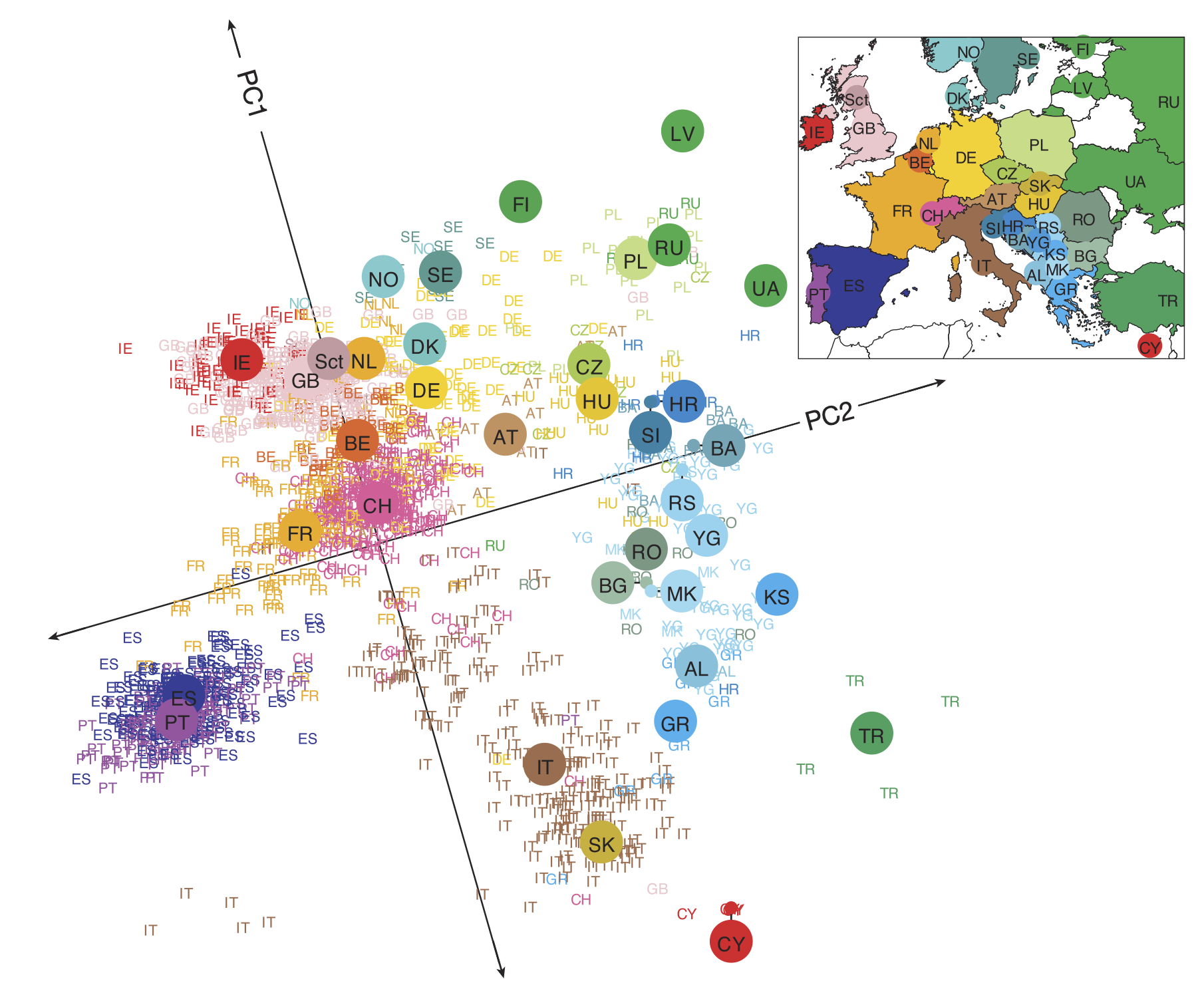 The projection of a collection of marker vectors sampled from individuals of known European ethnicity onto the plane produced by PCA with d = 2. Individuals cluster by country, and neighboring European countries remain nearby in the projected dataset.2
If we zoom in on Switzerland, we can see that the countries around Switzerland tend to pull individuals toward them based on language spoken (see figure below).
 A PCA plot (d = 2) of individuals from Switzerland as well as neighboring countries shows that an individual’s mother tongue correlates with the individual’s genetic similarity to representatives from the neighboring country where that language is spoken.2
And if we zoom farther out, then we can see continental patterns emerge, with India standing out as its own entity. What is particularly remarkable about all these figures is that humans on the whole are genetically very similar, and yet PCA is able to find evidence of human migrations and separation lurking within our DNA.
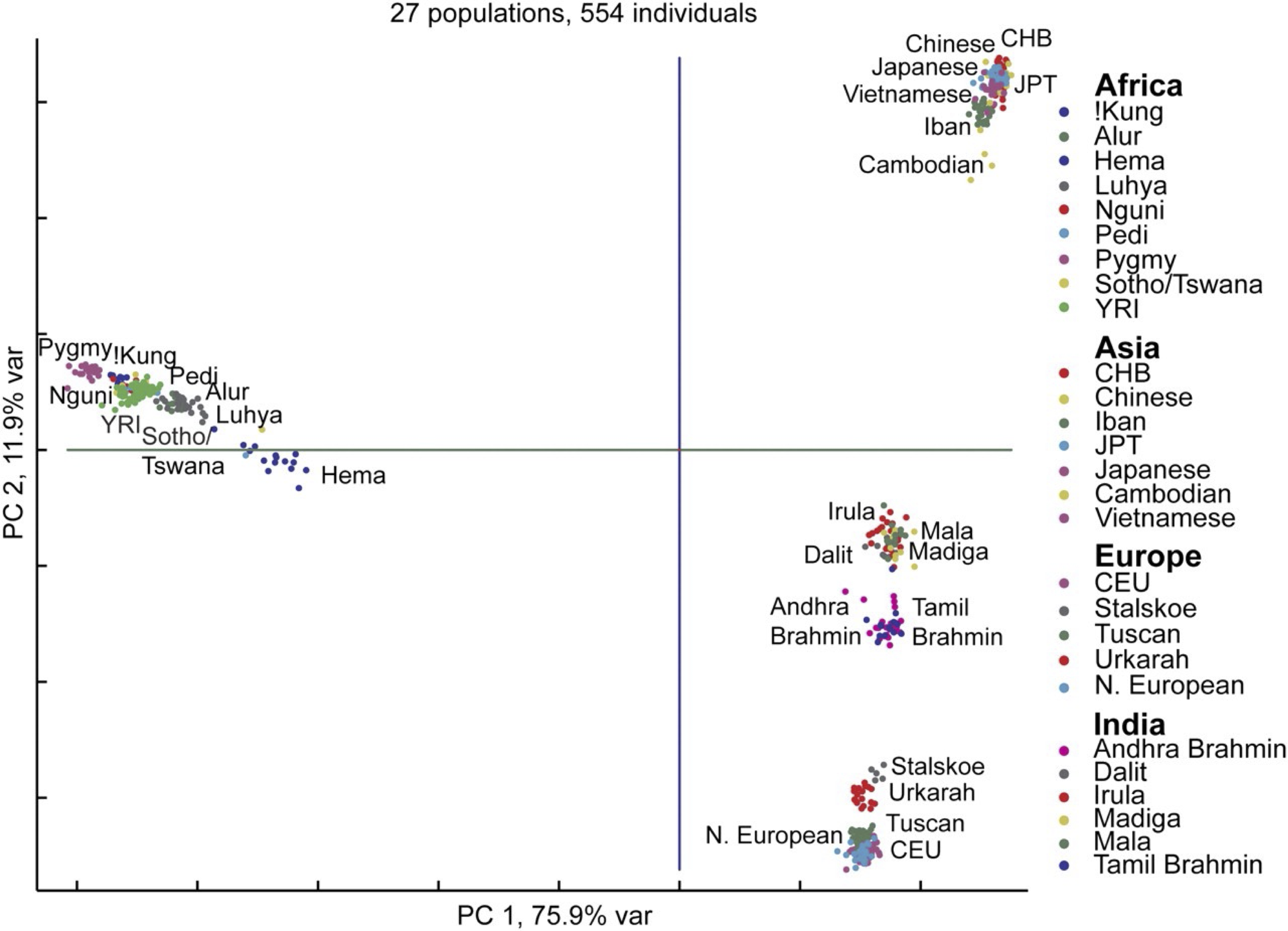 A PCA plot (d = 2) shows clustering of individuals from Europe, Asia, Africa, and India.3
Now that we have established the power of PCA to help us see patterns in high-dimensional biological data, we are ready to use CellOrganizer to build a shape space for our WBC images and apply PCA to this shape space to produce a lower-dimensional representation of the space that we can visualize.
Note: Before visiting this tutorial, we should point out that CellOrganizer is a much more flexible and powerful software resource than what is shown in the confines of this tutorial. For example, CellOrganizer not only infers properties from cellular images, it is able to build generative models that can form simulated cells in order to infer cellular properties. For more on what CellOrganizer can do, consult the publications page at its homepage.
Visualizing the WBC shape space after PCA
The figure below shows the shape space of WBC images, reduced to three dimensions by PCA, in which each image is represented by a point that is color-coded according to its cell family.
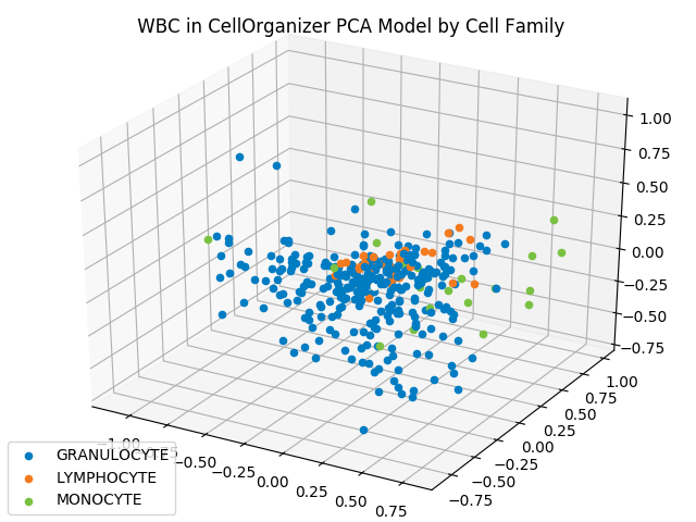 The projection of each WBC shape vector onto a three-dimensional PCA hyperplane produces the above three-dimensional space. Granulocytes are shown in blue, lymphocytes are shown in orange, and monocytes are shown in green.
We can also subdivide granulocytes into basophils, eosinophils, and neutrophils. Updating our labels according to this subdivision produces the following figure.
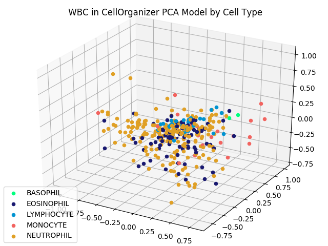 The reduced dimension shape space from the previous figure, with granulocytes subdivided into basophils, eosinophils, and neutrophils.
Although images from the same family do not cluster as tightly as the iris flower dataset — which could be criticized as an unrealistic representation of real datasets — images from the same type do appear to be nearby. This fact should give us hope that proximity in a shape space of lower dimension may help us correctly classify images of unknown family.
-
Amoeba, Stack Exchange user. Making sense of principal component analysis, eigenvectors & eigenvalues, Stack exchange URL (version: 2021-08-05): https://stats.stackexchange.com/q/140579 ↩
-
Novembre J et al (2008) Genes mirror geography within Europe. Nature 456:98–101. Available online ↩ ↩2
-
Xing J et al (2009) Fine-scaled human genetic structure revealed by SNP microarrays. Genome Research 19(5): 815-825. Available online ↩